Outside of Graphic Design I am also a professional musician. Both of these creative endeavours collided when my band Ransoms released a series of promotional singles.
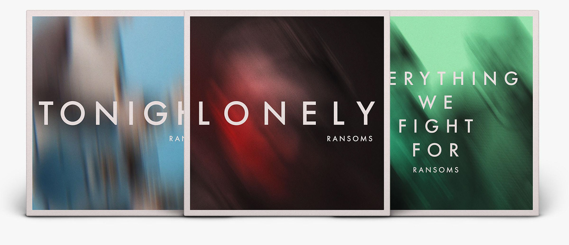
The first few singles had a consistent design theme, using the same typeface choice and blurred photography.

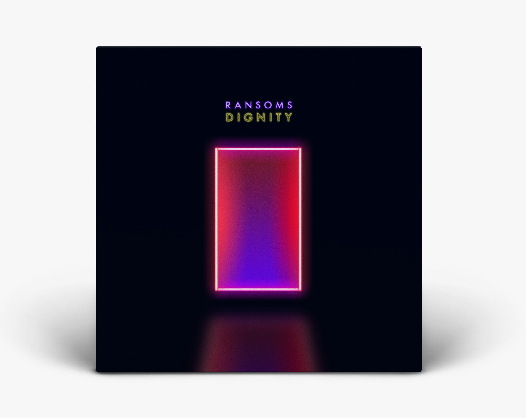
For the next single I used the same typeface as previous, but overall went in a different visual direction. The neon theme was carried through to additional motion assets.

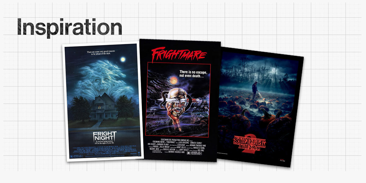
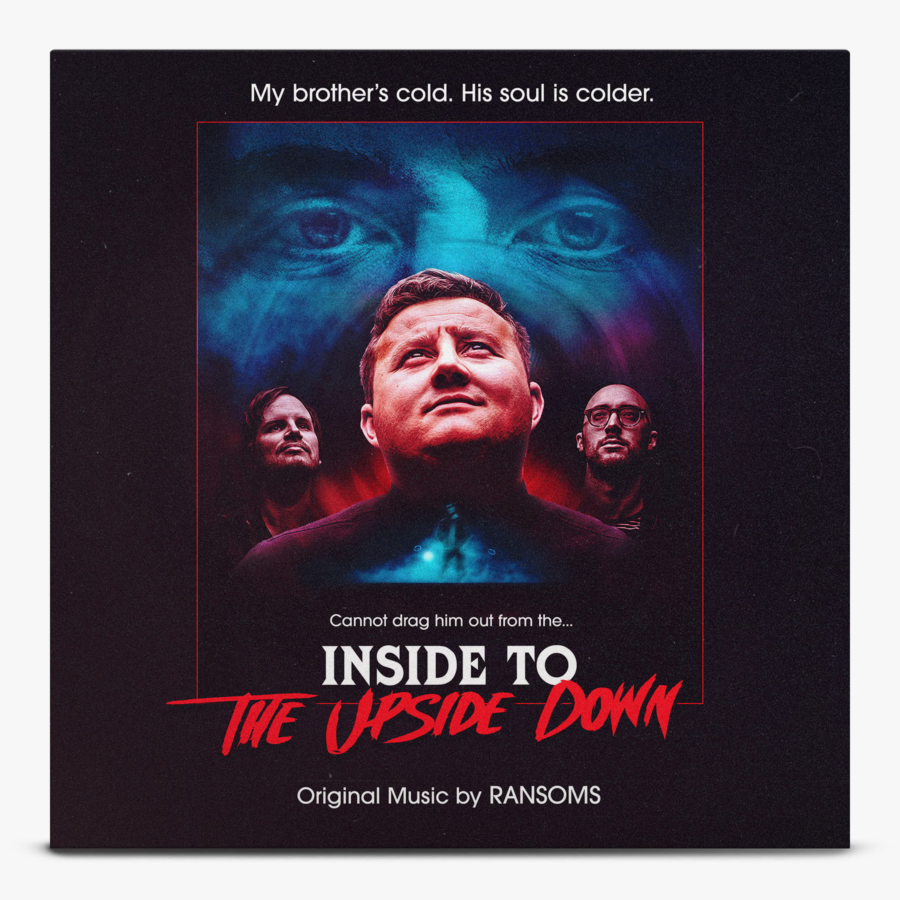
The next single was inspired by a 80s themed TV show, so it only felt right to go down the same route with the creative. I looked specifically at horror/thriller key art and tried to invoke a similar vibe in the single artwork.
The final cover artwork:
Motion Graphics were used in the promotional campaign of the single. Visually, I wanted these to feel as immersive as any social media content, but also as if they were genuine film titles from the 1980s – the addition of grain and subtle jittery movements helped finesse that look.

The final two singles were released in quick succession, so I wanted the cover art to show consistencies in style – both were black & white and used similar title treatment.
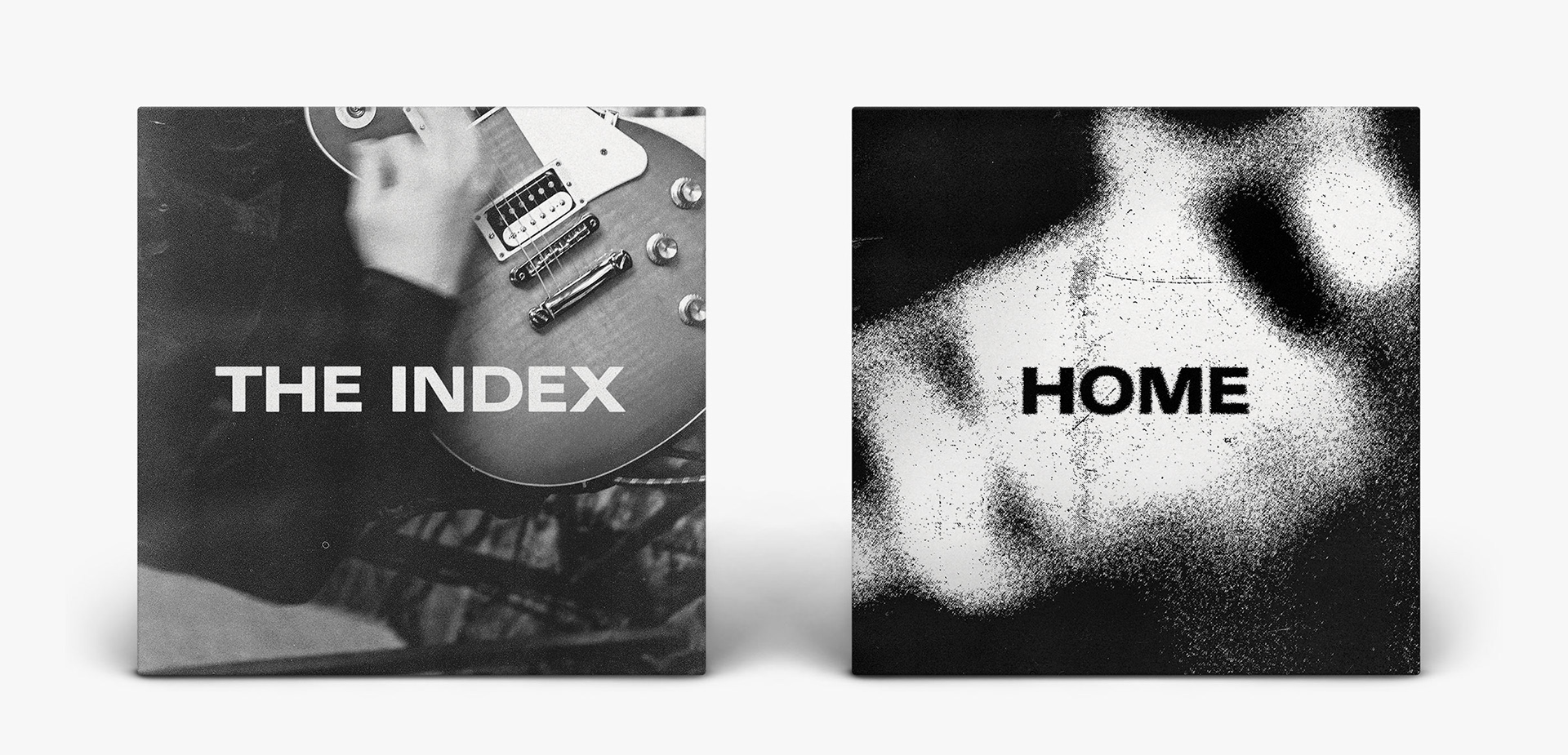
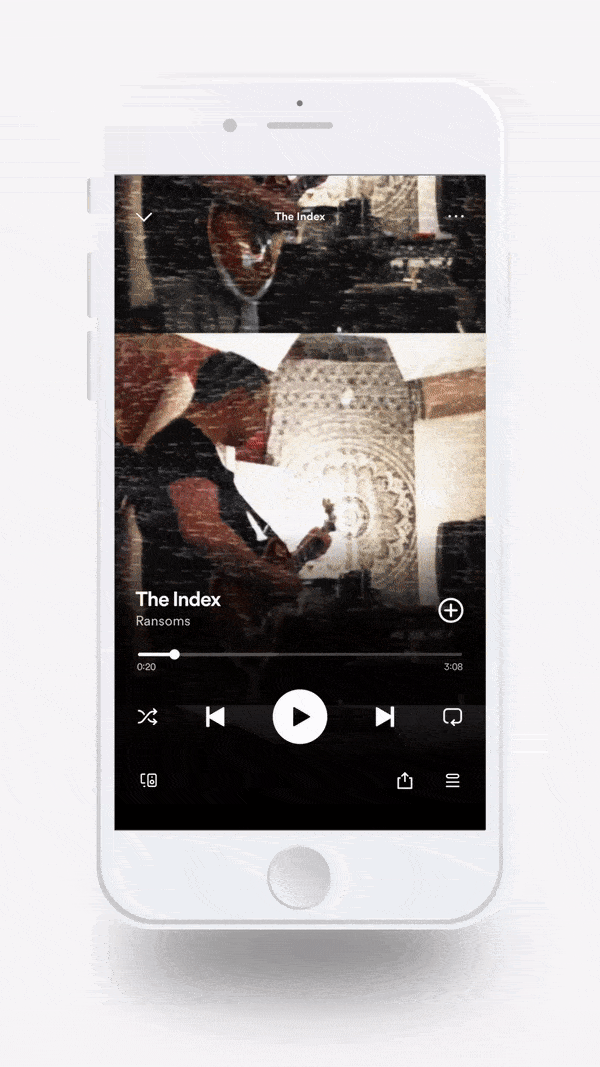
For 'The Index', promo was driven by video content. These were made to look like worn-out VHS recordings, interspersed with studio footage and an instructional dance video from the 80s (why not?!).
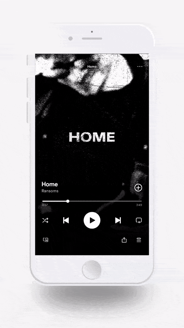
For 'Home', the source material was video from a live recording session. I manipulated the video with a combination of displacement effects to create a dark and gritty style.