Over the past few years I've led the creative for Singles, EPs and Album released by singer/songwriter, Nate Williams.
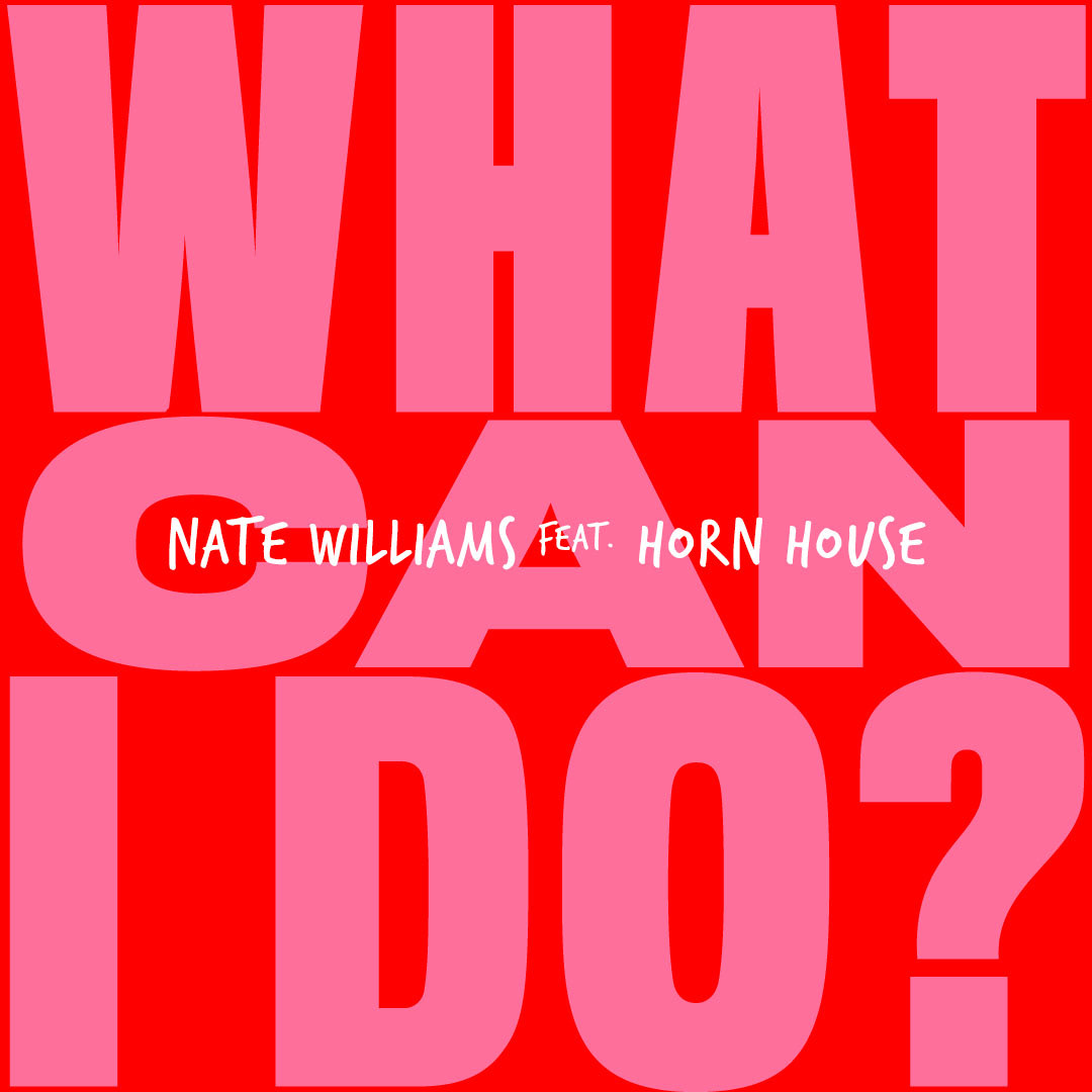
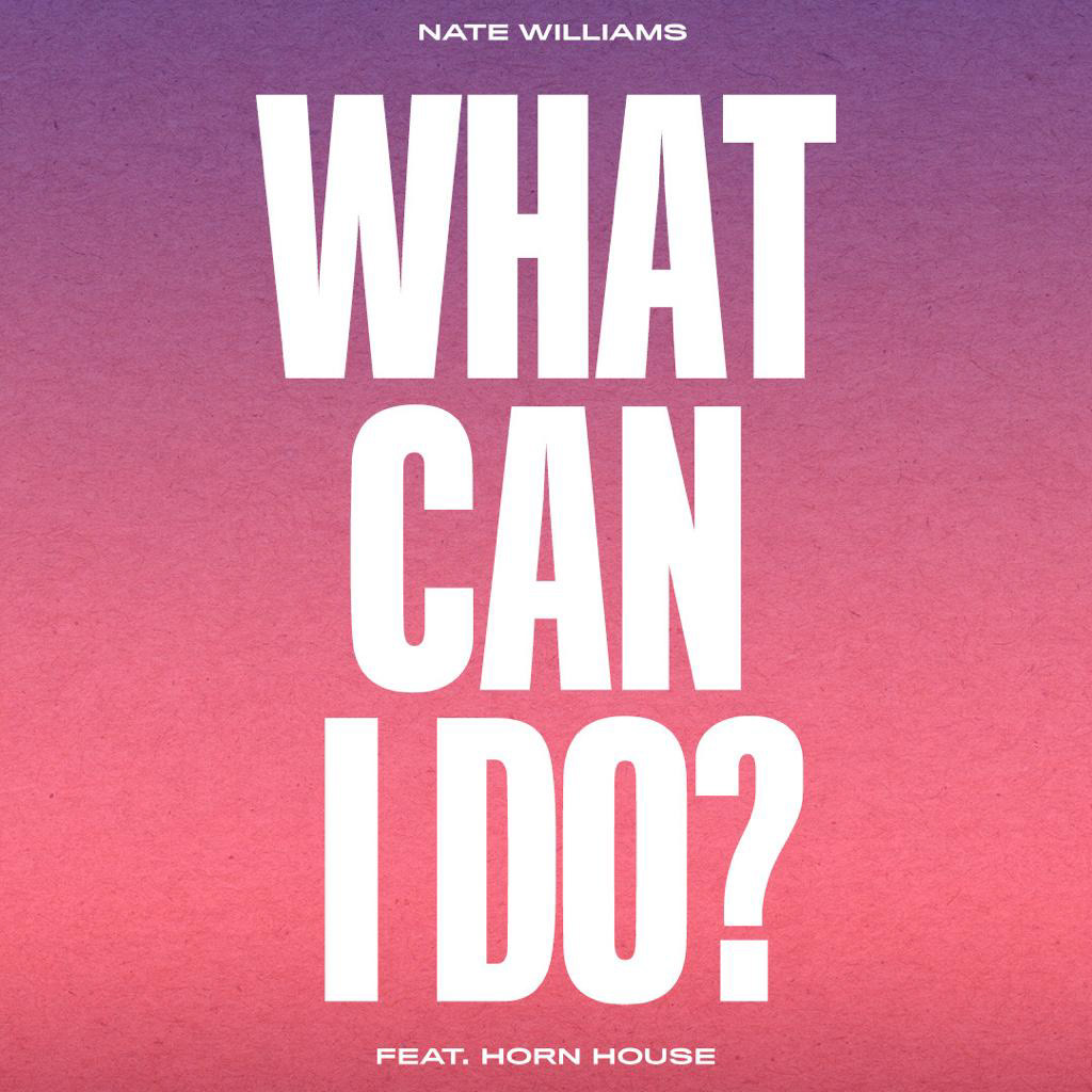
First up was the single artwork for "What Can I Do?". I wanted to create something bold and exciting to match the funky, upbeat feel of the song. I took inspiration from dance label releases from the 80s/90s. See the initial designs, final artwork and Spotify canvas below.

Next was the artwork and promo content for an EP release, "In Another Life".
This went through many design stages. Initial ideas centred on blurring/displacing a portrait of Nate.
This went through many design stages. Initial ideas centred on blurring/displacing a portrait of Nate.

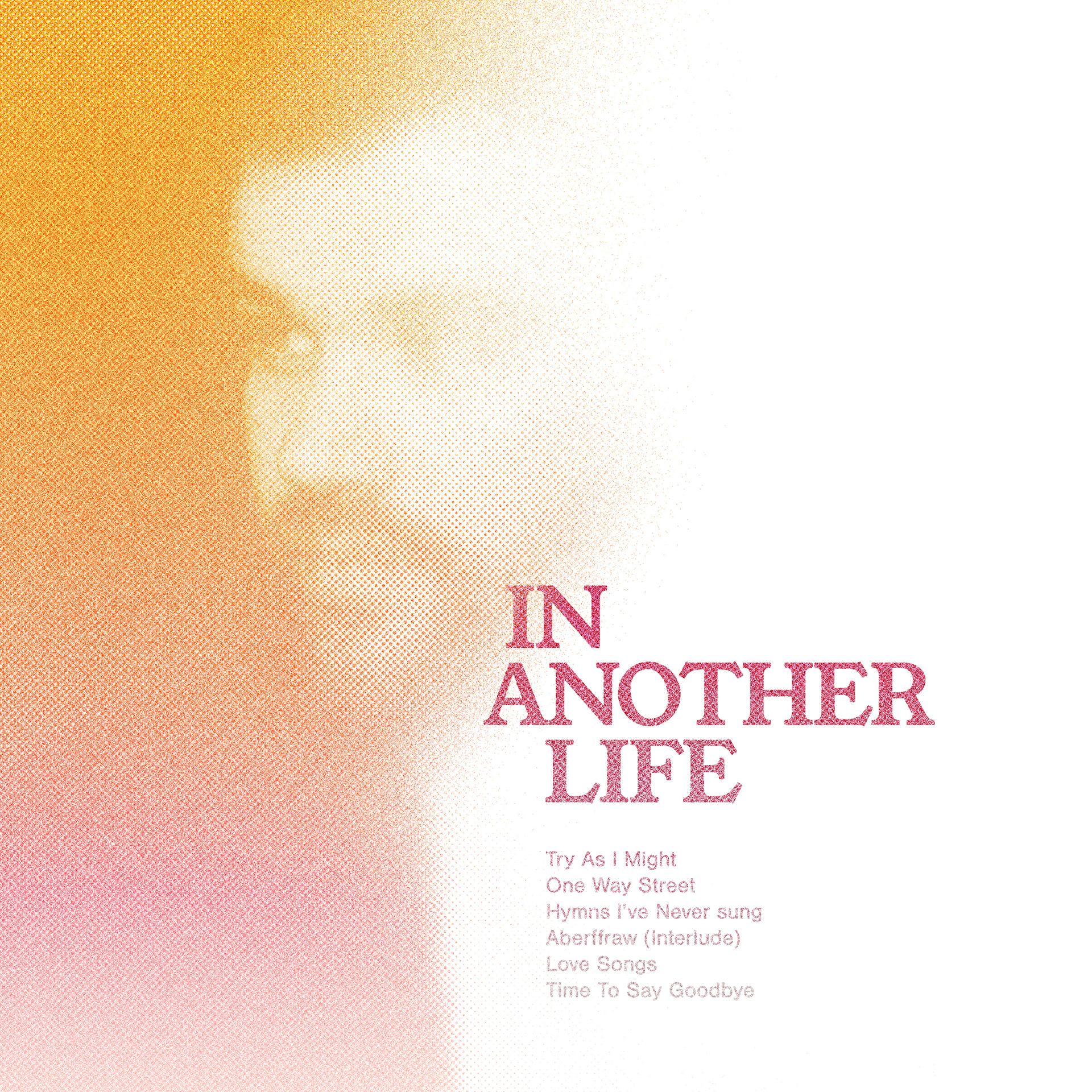
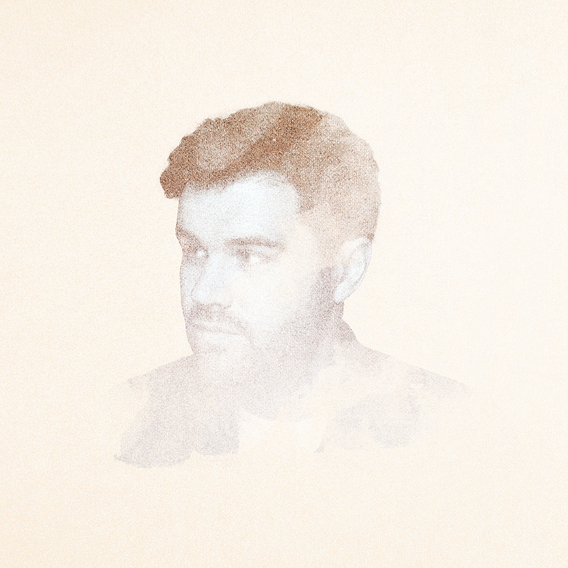
We ended up settling on the idea of using a contour line portrait as the main focus. This itself went through many iterations, as seen in the process vid below.
To promote the release of "In Another Life" I put together some video content. Firstly I animated the line drawing featured on the cover as a teaser, to initially advertise pre-orders, and then re-used with "out now" messaging. I then created teasers for each track, with musician credits as the focus.
The 3rd project was a Christmas EP, "When December Comes". Design inspiration came from the 50s/60s, particularly the illustrative style of 'Mid-Century Modern' animation and aspects of vintage vinyl sleeves from Blue Note Records.
I added record sleeve textures and subtle print effects to enhance the vintage vibe of the artwork. See the initial designs and final artwork below.


In terms of promo content, I created an animated version of the artwork and a credits video.
The most recent project was an album, "Chapters". Musically, the album takes a lot of inspiration from the 1970s, so I also looked to that era for artwork inspiration. I was particularly drawn to the work of Milton Glaser, and hoped to evoke aspects of his work into my designs, particularly his use of abstract letterforms and vivid colour schemes.
Some of the initial designs:


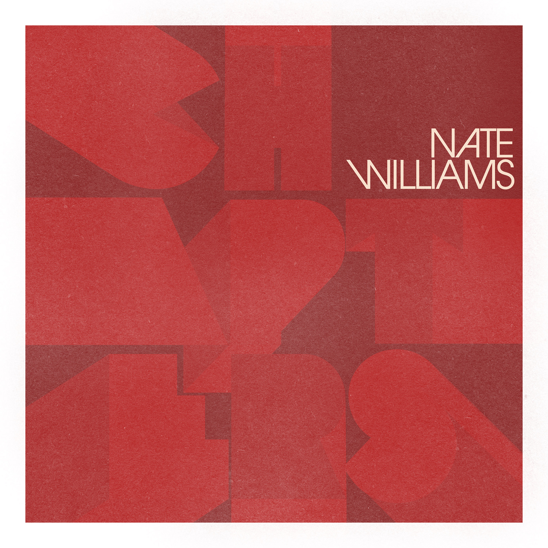

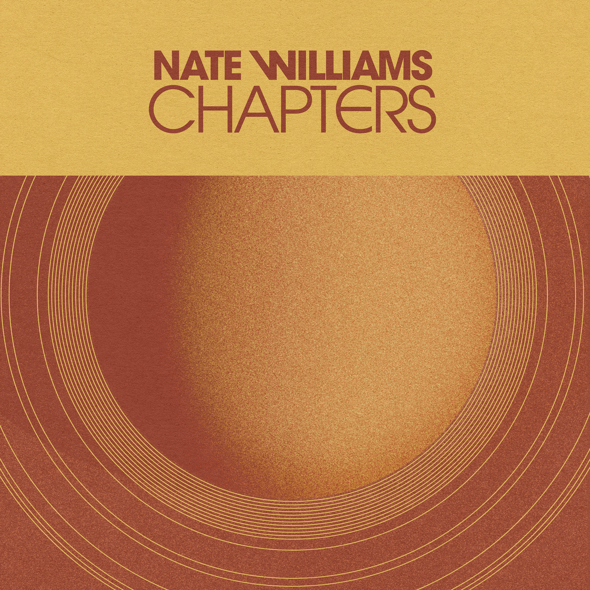
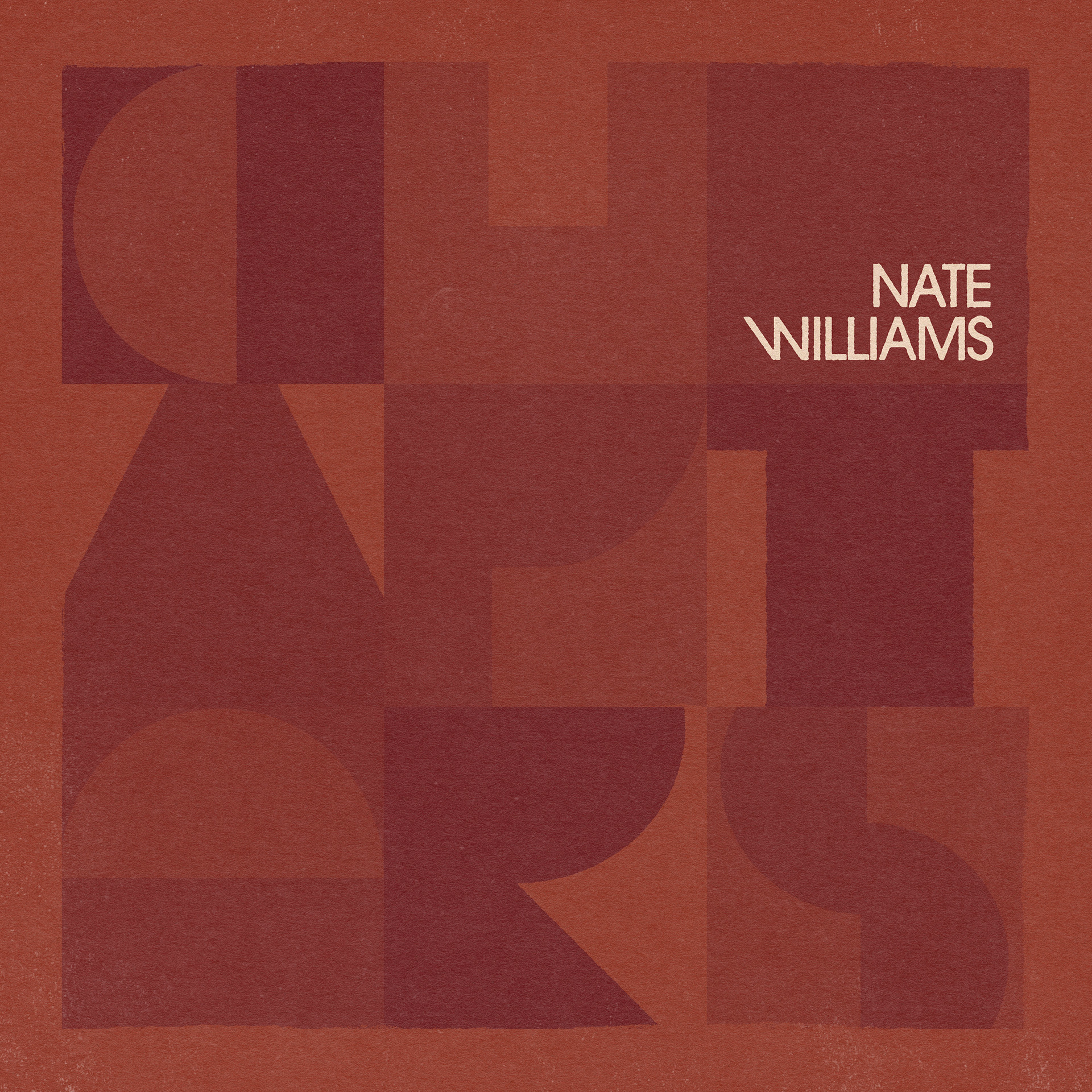
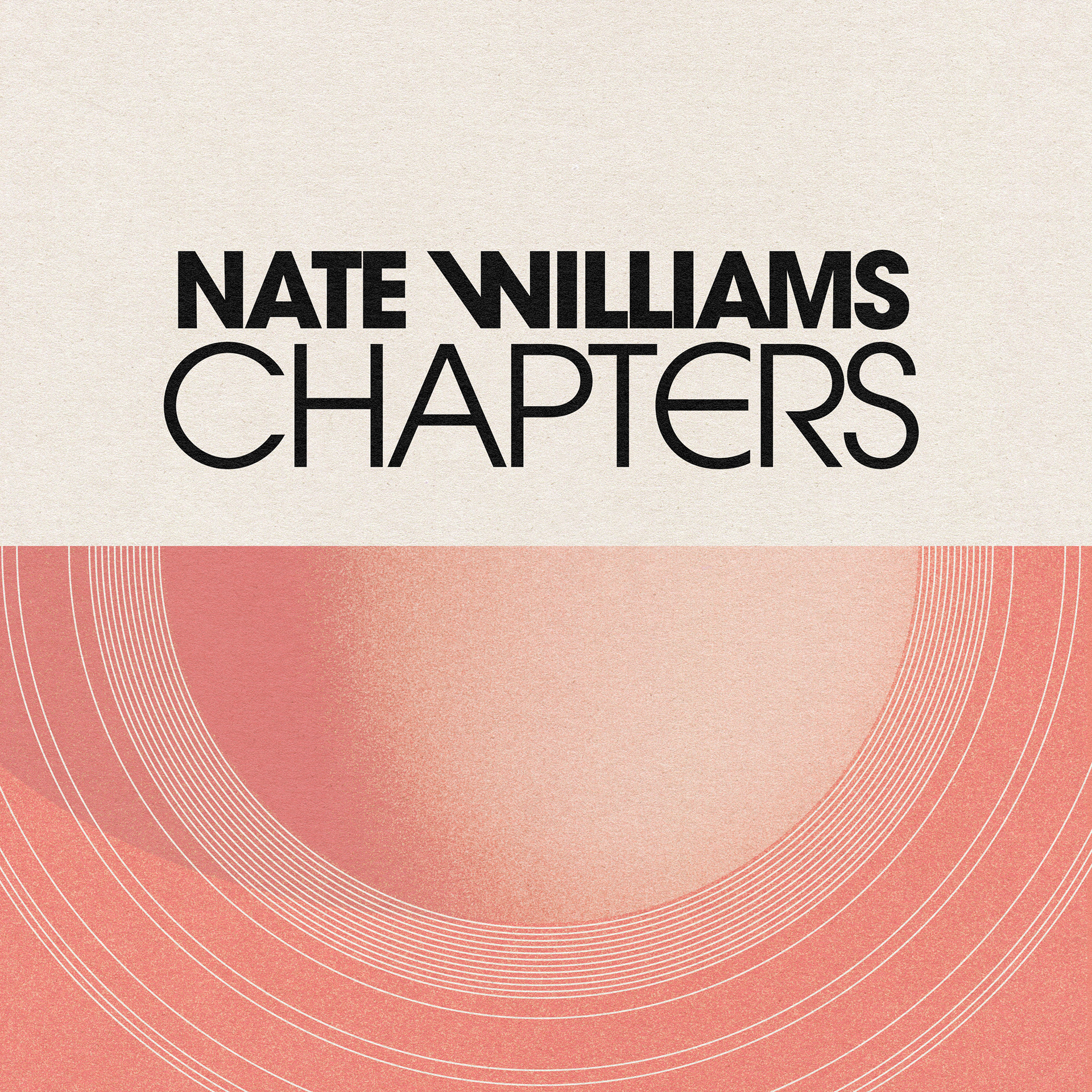
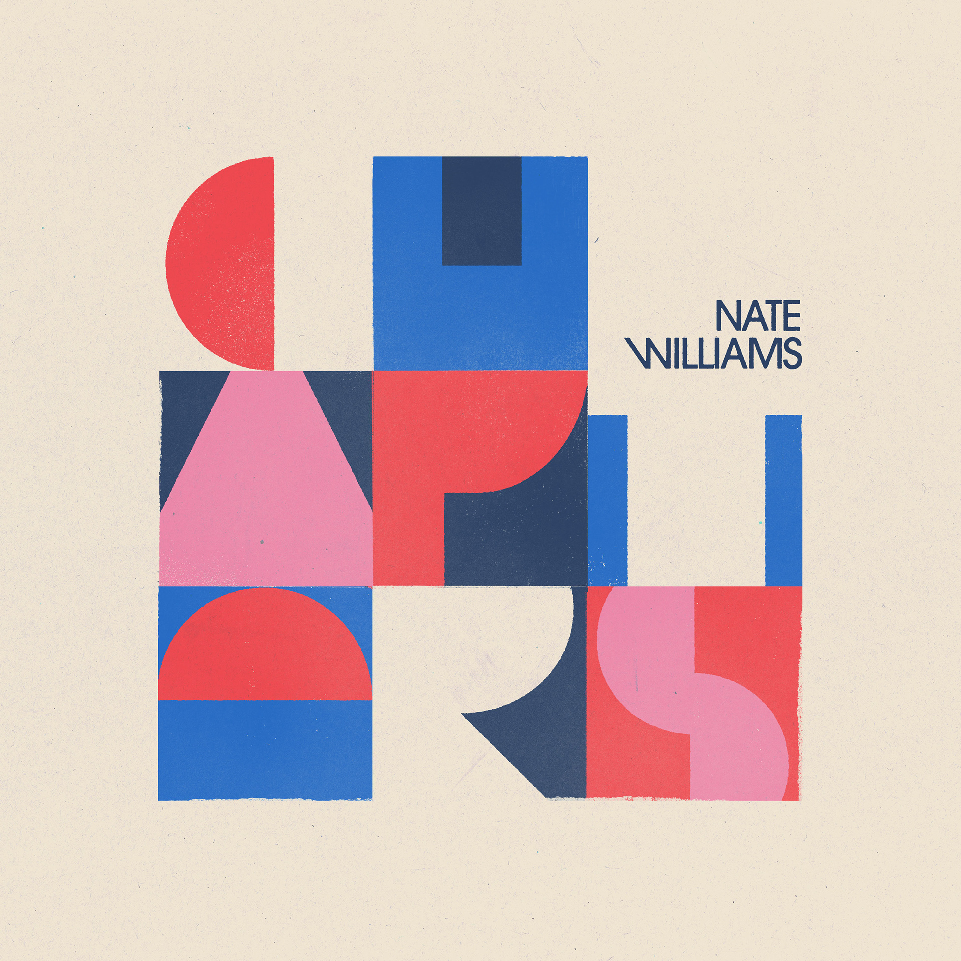
After a few rounds of variations, this was the chosen design (front and back cover):
Although the design was created digitally, I tried to make the cover look handcrafted by using distressed ink lines and roughened paint effects.
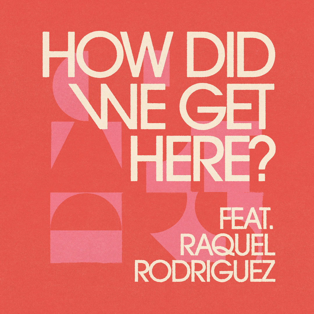
With the album cover complete, the next step was to create a series of single artworks. These acted as the first step in promo for the album, therefore it was important to follow a consistent theme in line with the album art.
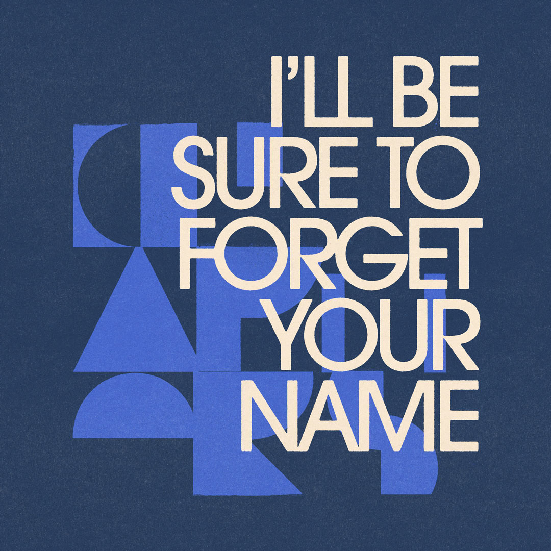


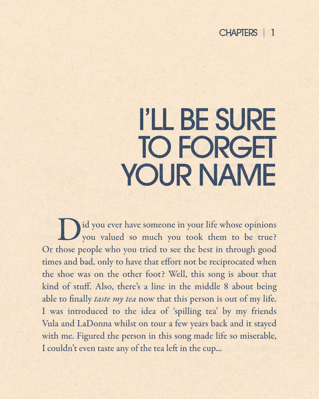
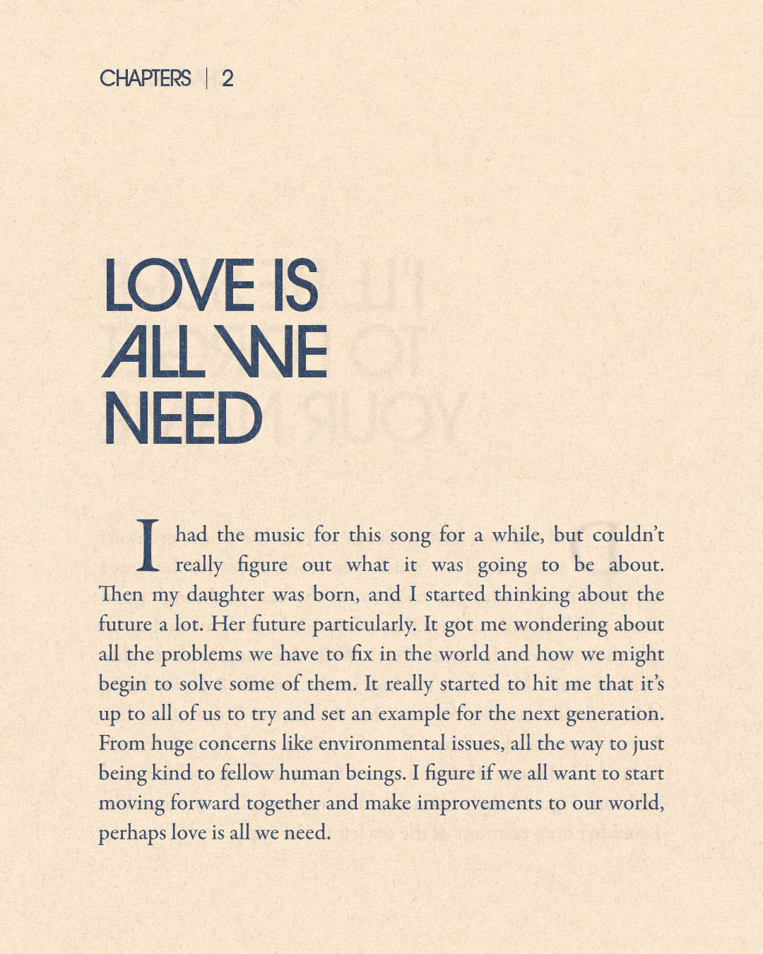
To complete the album promo, I created a series of images which provided background info on each track. These resembled pages from a book, to work in-line with the 'Chapters' theme.
